At this time, Google still does not confirm the release time of the new interface, so it does not confirm when the normal stable channel gets the Shelf layout.
Chrome OS has new Shelf desktop layout

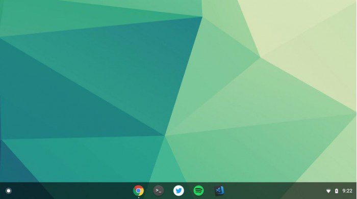
Chromium technology evangelist François Beaufort posted on Google+ on Friday that the Canary channel Chrome OS released this week will enable the new Shelf desktop layout. The most natural change to the newly designed user interface is that the application icon on the taskbar has moved from the lower left corner to the bottom centre, and the spacing between the icons is more compact and compact, allowing users to launch applications faster.

Image: Google+
The newly introduced Shelf layout has only one sorting method, with active applications on the right and inactive applications on the left. As with most experimental features, the modified UI doesn’t use by default, and the user needs to activate it manually. Users need to type chrome://flags/#shelf-new-ui in Chrome’s address bar. After you enable this feature and restart Chrome, you will see a new interface.


