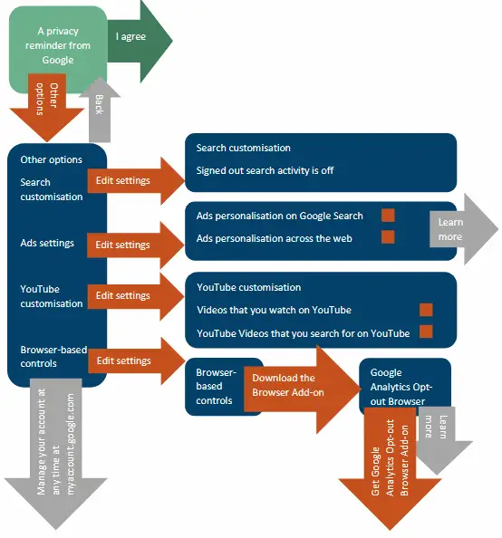
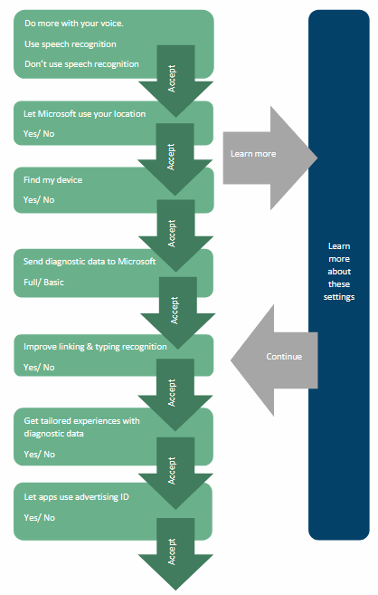
For example, the report says that existing Google’s personalised ads is cumbersome and requires multiple menus, much more difficult than choosing “I agree”. Throughout the process, search giants will persuade users not to turn off personalised advertising. The situation is similar to the Microsoft Windows 10 system; on Facebook, users need to click thirteen times to limit data collection and usage.

Here are some of the report’s conclusions on various topics.
The general conclusion:
All of the services nudge users toward accepting data collection through a combination of positioning and visual cues. However, Facebook and Google go further by requiring a significantly larger amount of steps in order to limit data collection.Conclusion on privacy dashboard that Google has rolled out to EU users:
By giving users an overwhelming amount of granular choices to micromanage, Google has designed a privacy dashboard that, according to our analysis, actually discourages users from changing or taking control of the settings or delete bulks of data. Simultaneously, as noted above, the presence and claims of complete user control may incentivise users to share more personal data.Conclusion on Facebook’s GDPR popup:
In the end, we conclude that users seem to not have been given a substantial choice, even after going through the extra effort of changing their settings with the intention of using their data protection rights.Conclusion on the use of dark pattern UI elements:
All three companies presented the settings that maximise data collection as the positive option. Dark patterns such as skewed wording, focus on positives such as “improve services”, glossing over potential negative consequences, and not explaining the full extent of the choices, all serve to nudge users toward allowing wider data collection and use.


