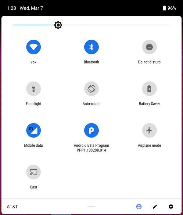
Google released the first developer preview version of Android P today, but in addition to the newly introduced egg, everyone is more concerned about the new system in the UI design adjustments. It should be pointed out that although Google quietly drummed up many things in the past few months, the software is still in a very early version of the compilation, so there will be great changes in the follow-up. From the first impression, Google tried to make Android P more colorful and mellow.
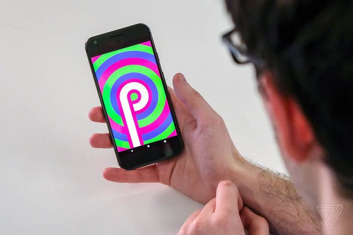
It is expected that Google will release the next developer preview version of Android P in May, and interested friends can carefully compare the differences between the two preview versions on Pixel and other devices.
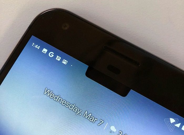
But first of all, let’s first take a look at the changes in the first developer preview version of Android P, such as moving time to the top left corner so that notifications are displayed more friendly.
Second, setting the menu becomes more colorful. Of course, in every major Android update, Google will continue to modify and adjust.

This is followed by a quick drop-down notification bar, which is clearly an area that Google wants to focus on. In addition to the common Wi-Fi, Bluetooth, and other icons, we found that the corners have become more rounded.
Then take a look at the bottom of the Dock. Compared to the previous version, its style has finally returned:
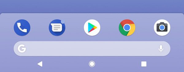
The first row consists of five commonly used icons: Phone, SMS, Google Play, Chrome, and Camera. The second row is the exclusive Google search bar. The third row is reserved for virtual buttons.
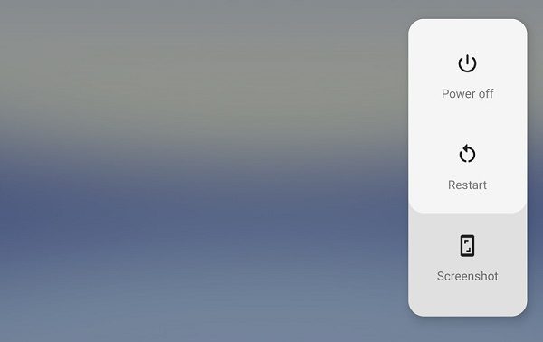
Interestingly, the power menu was moved to the right, and the three buttons were shut down, restarted, and screenshot.
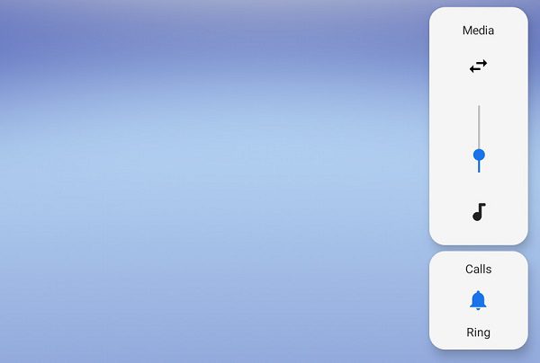
The volume control area is also moved to the right side of the screen.
Finally, SANS fonts used in Pixel products now appear in more places.
Source, Image: TheVerge