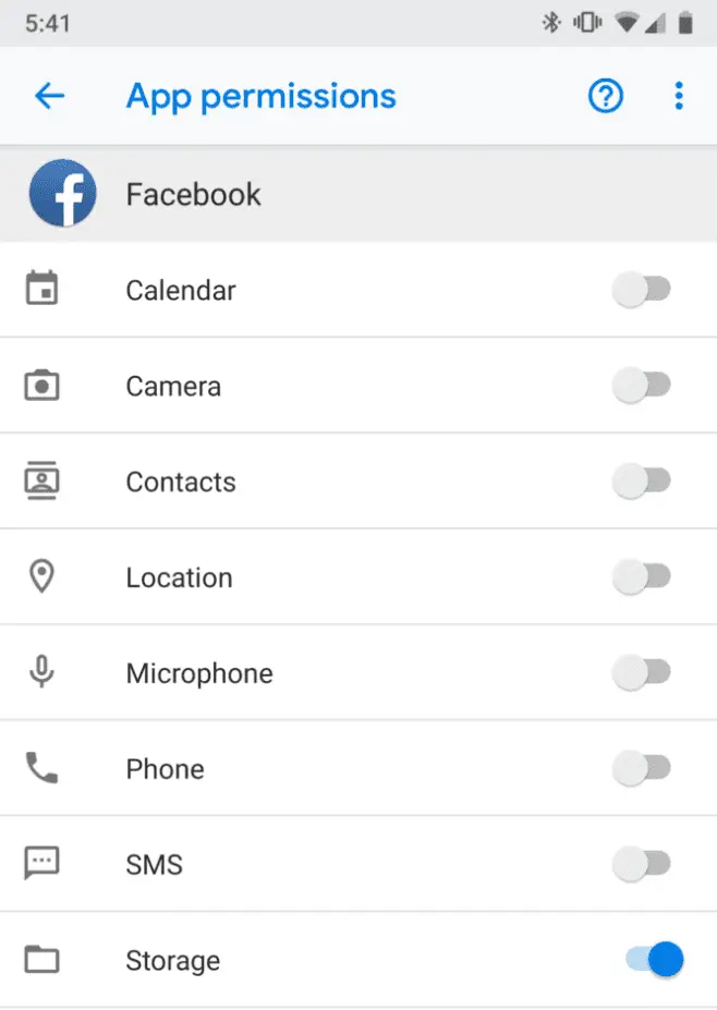
Recently, the Google development team has released a new developer preview version of Android P. The new preview version continues to adjust the UI interface to replace the icon material.
In addition to the UI icons in the settings, the home button and the return button also adjusted. Let’s see what these adjustments are.
As shown below: The UI icons for the help options, backup options, multi-user options, and system update options in the system settings have been fine-tuned.
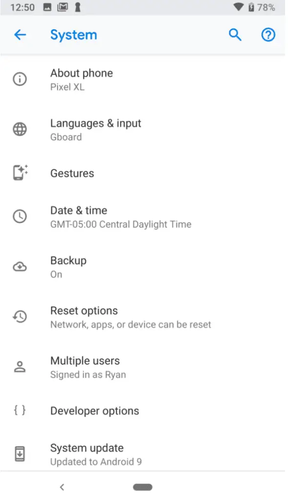
The Android P DP2 version on the left and the latest Android P DP4 on the right, where the image arrow of the backup button option changes from up to down.
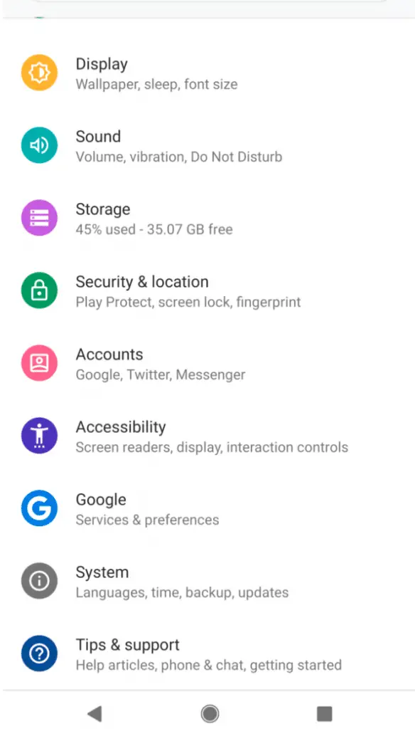
Below: For example, the icon of the sound option has become hollowed out. In the Android P DP4 version, many icons are replaced by the empty icon.
Security settings, account options, and help and support are also replaced with shortcut icons, but the icons for accessibility are still populated into three more points.
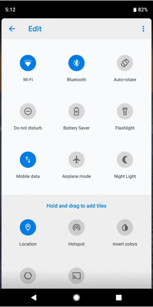
Below: The notification centre, do not disturb mode, battery mode and flashlight and other icons have also been replaced, it seems that Google will continue to change the next update.
Below: The options icons in the application rights management have been replaced, and the home button and the back button in the bottom menu have been removed in the new version.

In the final volume adjustment, the icon is also replaced with a hollow one. At present, there is still some time to release the official version of Android P. It is estimated that Google will continue to change it.
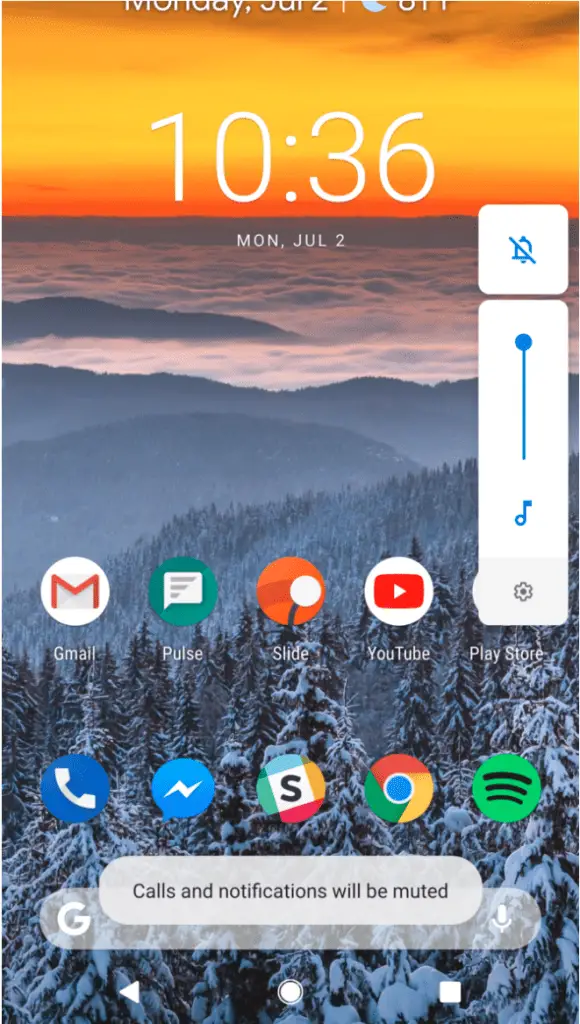
Source, Image: android police