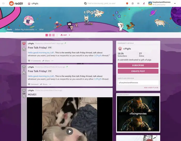
According to Wired, Reddit’s website has undergone the first major revision in 10 years. Starting today, 1% of lucky users have the opportunity to experience the new interface. In the coming months, Reddit will make some fine-tuning, and then launch this new design to all users and watchers. However, before this, people who see the new version in advance can still choose to switch back to the classic view.
 The navigation bar on the left is replaced with a menu in the upper-left corner, which is similar to the templates for trendy websites such as Squarespace, Wix, and Tumblr.
The menu bar provides links to message flows, subscription concerns, and user profiles, while users can browse Reddit in three modes:“classic view” which looks more like the Reddit we know today, “card view,” which vaguely resembles Facebook, or “compact view,” for more densely packed information.

In order to make new users more intuitive, the revised Reddit also uses different fonts to distinguish intra-site links or other articles. In addition, to encourage content creation (new posts), a big blue button (r/all) is provided on the home page.
Posts can be opened in the box above the homepage, avoiding forced redirects each time a link is clicked.
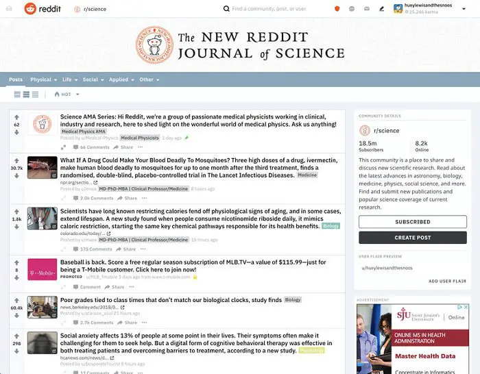
 Reddit Classic View
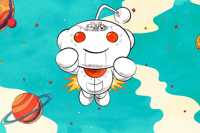
In addition to the above-mentioned feature changes, Reddit also redefines the town station treasure (mascot Snoo) and now it looks more 3D. New users will use Snoo’s avatar by default until the photo is manually replaced.
Source: theverge