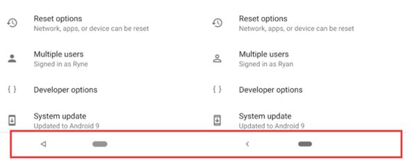
Yesterday, the Android P DP4 version was just released, and the foreign media AndroidPolice digs out a lot of new changes. One of the changes involves the most commonly used return key for Android. In the fourth development preview, they found that the navigation bar icon of Android P has changed. The original return key is a hollow triangle, and the home button is a light grey oval. These two buttons change with the update.

After the update, the return key becomes a left arrow, and the colour of the home button is deepened to become a dark grey oval.
After the revision, the home button looks more concise and is more like a design in the official version, but considering that some mobile phone manufacturers are already popularising full-screen gestures, and also have the habit of customising button shapes, no matter how Android changes.