Firefox will have a new logo design with different icons for different product lines
After years of precipitation, Mozilla Firefox has become one of the most recognizable logos for PC users. Although Firefox has made some adjustments to its logo before, it is fine-tuned, and the overall image has not changed significantly.
With the rapid development of the Internet, Firefox is building a new browser and a series of new applications and services based on the Internet, from simple screenshots and file sharing to access the Internet using voice and VR. Help users manage their online time more efficiently and safely. Therefore, Firefox believes that as a logo, the current Min Fox with a flame tail is not a good representation of the entire product line. Even if you re-color or decompose the fox, it is difficult to make a big difference, and you need to restart the design completely.
Mozilla’s team of product and brand designers has begun to build a new system to cover all of the Firefox products that are in the pipeline and those that are still in the minds of emerging technology departments. They shared two designs on the official blog to solicit feedback from users.
![]()
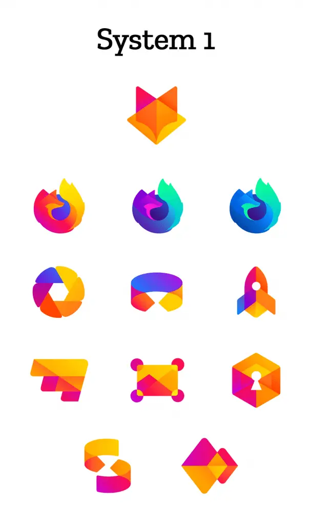
Both of the above systems consist of four parts. First, the top is the icon of the master brand, representing the entire product line. The first line contains Firefox Quantum and its variants Developer Edition and Nightly browser icons. The second line is more targeted browser icons like Firefox Focus and Firefox Reality. The third and fourth lines represent icons for new apps and services that can release under the Firefox brand.
The design team said that the currently listed logo is not the final design, and the elements, layout, naming, etc. still need to be improved. They also stressed that the current collection of user opinions is not a vote, so there is no voting result, just looking for some useful feedback on these icons. Also, if you want to create your own logo of a gif app, there are many websites that help do it.
Source, Image: Mozilla